Archetype toolkit · Archetype 8 of 12
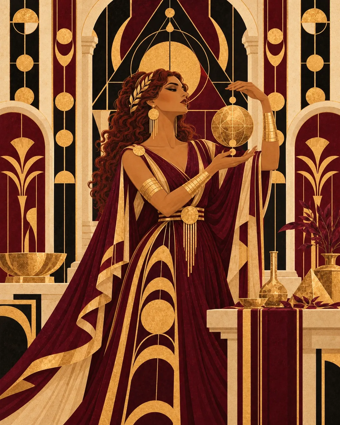
La Guardiana(The Guardian)
Rooted inThe Caregiver · The Hero
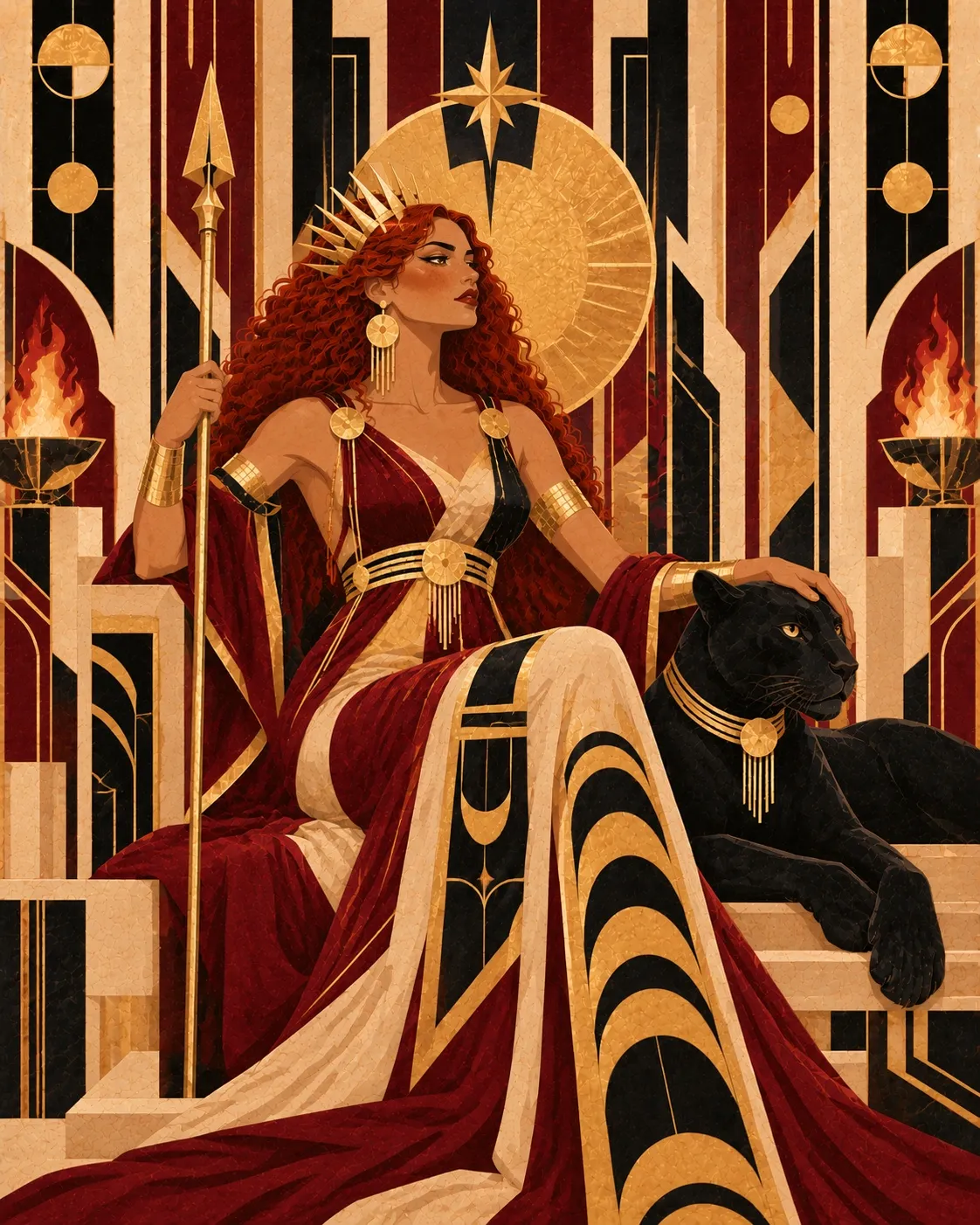
La Guardiana is the tireless protector, the one who watches over safety, order and harmony within her community or sphere of influence. Her presence is solid and dependable, and it conveys emotional stability and deep commitment.
She is the anchor that keeps values and purpose intact, caring for the wellbeing of everyone involved.
Read each section and keep what resonates. It is a reference for your brand.
Core desire · Core fear
Core desire
To protect and care for those who depend on her, ensuring a safe and harmonious environment.
It shows up in your brand promise, your main narrative and the kind of transformation you communicate. Ask yourself: does my brand really promise this?
Core fear
Betrayal, negligence or a loss of control that puts her community at risk.
It tells you what to avoid in your communication and which strategic mistakes can pull your brand out of alignment. If you communicate from this fear, your brand weakens.
Role in the narrative
She is the bulwark that holds the hero and the community in moments of vulnerability, offering refuge, guidance and comfort.
It defines the part your brand plays for its audience: guide, protector, leader or transformer. That way you avoid communicating from the wrong role.
Motto
I protect what I love with strength and tenderness.
Use it as a brand mantra, as a guide for headlines and your bio, and as a filter for your decisions: does this honor my motto? Embodying it matters more than publishing it.
Brand strategy
Brand strategy
It tells you which messages to prioritize, which bond to build with your audience and how to position yourself in your market. Use it to check that your offer and content are aligned.
Build trust through transparency, social responsibility and genuine commitment. Her communication shows care, reliability and an authentic dedication to wellbeing.
Aesthetic
Aesthetic
Color palette
- Deep blue, forest green, pure white, warm beige, soft grey.
Choose one base palette as a reference. Look for the color feeling your brand should convey.
Textures
- Organic cotton, natural wood, soft leather, sturdy weaves.
Draw on the feeling (soft, rough, ethereal, solid) and carry it into backgrounds, photography and printed materials. Textures build the atmosphere of your brand.
Visual elements
- Shields, open hands, homes, roots, sturdy trees, complete circles.
Select two or three recurring elements and repeat them to build visual coherence. Less is more.
Typography
- What to look for
- Solid, stable, legible sans serifs.
- What it should convey
- Protection, trust, stability and responsibility.
- Visual feeling
- Firmness, safety, structure.
- Where to use it
- Services, informative text, processes, functional platforms.
- What to avoid
- Fragile, chaotic or overly ornamental typefaces.
Language
Keywords
Use them as a word bank for your copy, across text, web, social and descriptions. If a word does not represent you, drop it.
- Protection
- Warm
- Firm
- Empathetic
- Responsibility
- Love
- Trust
- Loyalty
- Care
- Refuge
- Stability
- Steadfastness
- Integrity
- Safety
- Commitment
Language and tone
Serene, warm, approachable. She speaks with empathy, offering support and backing. Her language is clear, close and reassuring.
Define which tone leads and which energy should be felt when someone reads you. This section guides how your brand sounds as well as what it says.
Communication style
Kind, clear and responsible, with a protective, maternal shade that never loses professionalism.
Call to action examples
- Trust our protection
- Join our community
- Secure your wellbeing today
- Grow with solid support
Message examples
- Your wellbeing is my unwavering commitment.
- Here you will find a space where you will always be cared for.
- We protect what you value most.
- Your safety is our priority.
Use them as inspiration: study the structure of each sentence and write your own. If your brand does not sound like this, something is out of alignment.